Creating Bar Graphs in R
April 2015
Bar graphs are a common visual representation of distributed data. Numeric values are generally shown on the y-axis while category values are displayed on the x-axis. I will demonstrate how bar graphs are created in R using data from the Consumer Complaint Database.
The Consumer Complaint Database contains complaints received by the Consumer Financial Protection Bureau (CFPB) on financial products and services such as bank accounts, credit cards, credit reporting, debt collection, money transfers, mortgages, student loans, and other types of consumer credit. The database contains over 100,000 anonymized complaints. The data is publicly available at data.gov.
R Code
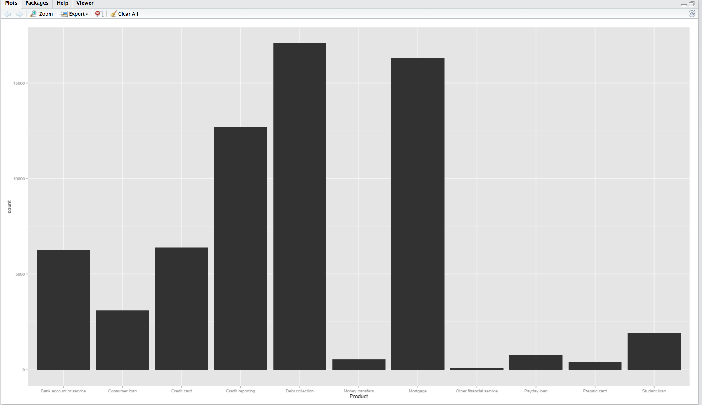
This bar graph provides a visual display of the products.
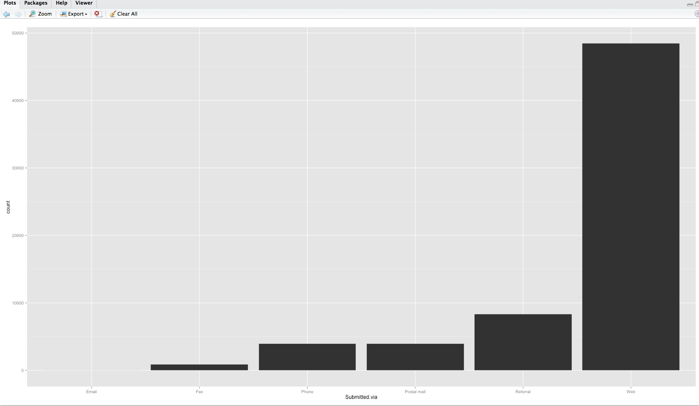
This bar graph provides a visual display of how the complaints were submitted.
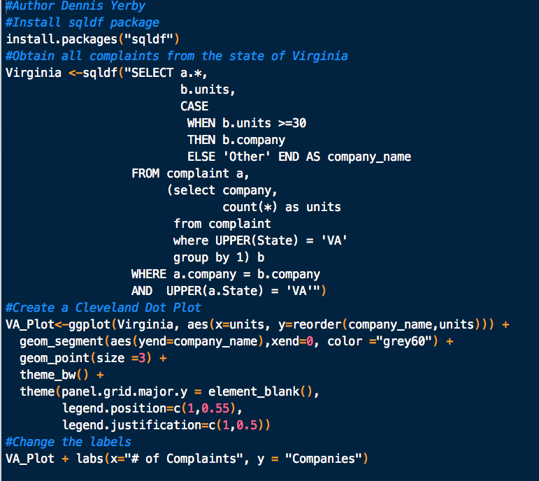
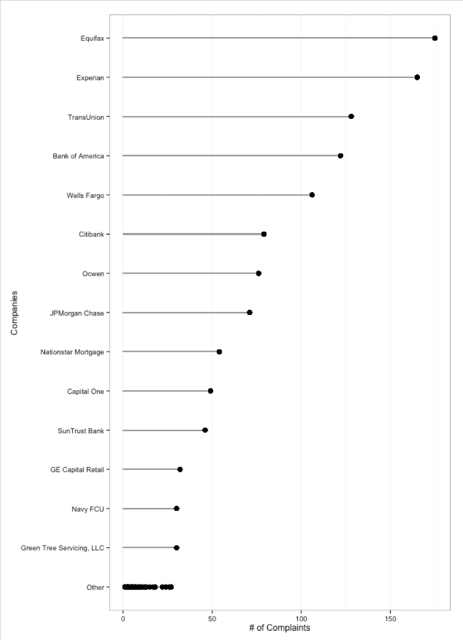
What if you wanted to view the number of complaints for a particular state? Let's look at the state of Virginia and view the complaints by company in what is known as a Cleveland Dot Plot.
R Code
Cleveland Dot Plot
The Consumer Complaint Database contains complaints received by the Consumer Financial Protection Bureau (CFPB) on financial products and services such as bank accounts, credit cards, credit reporting, debt collection, money transfers, mortgages, student loans, and other types of consumer credit. The database contains over 100,000 anonymized complaints. The data is publicly available at data.gov.
R Code
This bar graph provides a visual display of the products.
This bar graph provides a visual display of how the complaints were submitted.
What if you wanted to view the number of complaints for a particular state? Let's look at the state of Virginia and view the complaints by company in what is known as a Cleveland Dot Plot.
R Code
Cleveland Dot Plot